
Every great drawing starts before the first brushstroke. Before the color, before the shadow, before the texture — there’s something simpler and more fundamental holding everything together. Most people walk past it without noticing. Artists can’t stop thinking about it.
The Art of Seeing: Exploring Outlines and Edges
Art is, at its core, an act of seeing. Not just looking — actually seeing the boundaries that separate one thing from another, the lines that give shape to empty space.
- An outline is the line that marks where one object ends and the world around it begins
- Edges are the perceived boundaries between shapes, values, and colors — they may or may not involve an actual drawn line
- Together, outlines and edges form the visual skeleton of every artwork, from cave paintings to digital illustration
Most beginners draw what they think objects look like. Trained artists draw what they actually see — and the difference lives entirely in how they read outlines and edges.
Definition of Outline in Art
An outline is a line drawn along the outer boundary of a shape or figure that defines its form without adding interior detail, shading, or texture.
- It’s the first mark most artists make
- It defines the object’s shape against its background
- It simplifies complex forms into readable, recognizable structures
- It works in every medium — pencil, ink, digital brush, paint
Think of it as the skeleton before the body. The floor plan before the building. Everything else in the drawing gets built on top of it.
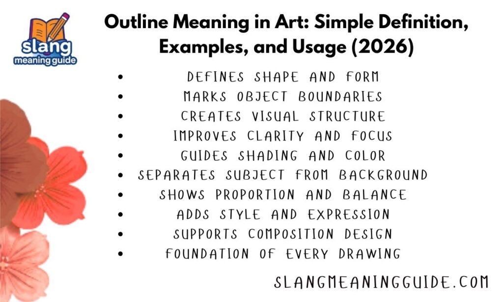
What is the Use of Outline in Art?
Outlines do more than just trace an edge — they carry a lot of visual weight and communicative power.
Structure and proportion: Outlines help artists establish correct proportions before committing to detail
Clarity: They separate overlapping objects so viewers can read complex compositions easily
Style: A bold outline signals cartoons, comics, or graphic design; a delicate one suggests realism or sketching
Guiding shading: Outlines give artists a contained space to add value, color, and texture
Hierarchy: Varying line weight tells viewers what matters most — thicker lines draw the eye, thinner ones recede
Without outlines, many compositions would collapse into visual noise. They’re the reason a quick sketch still reads as a human face, a chair, or a mountain range.
Origin and History of Outline in Art
The use of outline is as old as human mark-making itself.
30,000+ years ago: Cave artists at Lascaux and Altamira used outline to define animal forms on rock walls
Ancient Egypt: Artists used strict contour lines to represent figures, always from the most recognizable angle
Ancient Greece: Contour line drawing on pottery became a refined, celebrated art form
Renaissance: Artists like Leonardo used sfumato to blur outlines, creating soft transitions rather than hard edges
19th century: The word “outline” shifted from purely visual art into written language, used to describe summaries and plans
20th century: Expressionists and cartoonists pushed outline to emotional and stylistic extremes
Today: Digital tools like Procreate and Illustrator have made outline one of the most searchable art fundamentals online
The technique hasn’t changed much. What has changed is the intention behind it.
Types of Outlines in Art
Not all outlines look or function the same way. Here are the main types artists work with:
Contour line: Traces the outer and inner edges of a form — it follows the shape as if your pen never left the page
Gesture outline: A loose, quick sketch outline used in the early stages of a drawing to capture movement or proportion
Blind contour: Drawing the outline without looking at the paper — trains your eye-hand coordination
Implied outline: Suggested through contrast or color without an actual drawn line
Cross-contour: Lines that run across the surface of an object to show its three-dimensional form
Expressive outline: Lines with varied weight and rhythm, used to convey emotion rather than precise shape
Geometric outline: Clean, precise lines common in graphic design, logos, and architectural drafting
Each type serves a different purpose. Knowing which one to use — and when — is part of what separates a beginner from a working artist.
What are Edges in Drawing?
Edges are not always outlines. This is one of the most important distinctions in drawing.
An edge is any perceived boundary in a drawing — it can be created by:
- A drawn line (outline)
- A contrast in value (light meets dark)
- A shift in color
- A change in texture
The four types of edges most artists work with:
- Hard edge: A sharp, clear boundary between two shapes — pulls the viewer’s eye and signals importance
- Soft edge: A gradual transition — creates depth, atmosphere, and texture
- Lost edge: A boundary so gradual it nearly disappears — forces the viewer to fill in the gap mentally
- Found edge: A deliberately sharp edge placed to redirect attention within a composition
Great artists don’t treat all edges the same. They vary edge quality to control where you look, what feels close, and what recedes into the background.
The Power of Defining Spaces
One of the most overlooked lessons in drawing is that the space around an object is just as important as the object itself.
- Negative space is the area surrounding a subject — its shape is defined entirely by the subject’s outline
- Learning to see and draw negative space is one of the fastest ways to improve proportion accuracy
- Outlines don’t just contain the subject — they simultaneously create the shapes of the surrounding space
- Strong compositions use both positive and negative space deliberately
A good outline does double duty. It defines what something is by simultaneously defining what it isn’t.
Real-Life Examples of Outlines (With Short Dialogues)
Example 1 — The beginner sketch:
“Why does my drawing look flat?” “Try varying your outline weight. Make the bottom edges darker and thicker — it’ll give the object a sense of gravity.”
Example 2 — Digital illustration:
“I want my character to pop against the background.” “Add a thin, slightly darker outline around the whole figure. Separation is everything in character design.”
Example 3 — Life drawing class:
“Should I outline the whole body first?” “Start with a gesture outline — just the movement. Refine the contour after you’ve got the pose right.”
Example 4 — Comic art:
“Why do comics use such thick outlines?” “Bold outlines hold up at small print sizes and make shapes instantly readable. It’s a practical choice that became a style.”
What can we learn from Egon Schiele?
Egon Schiele (1890–1918) is one of the clearest examples in art history of what happens when outline becomes the primary expressive tool.
- Schiele used contour lines almost exclusively in his early work — raw edges with little to no shading
- His lines were jagged, angular, and deliberately rough — not trying to describe beauty but to expose psychological tension
- His teacher encouraged him to see objects as interplays of positive and negative space, a lesson that never left him
- The line wasn’t just descriptive for Schiele — it was emotional. Anxiety, vulnerability, and desire lived in the quality of the line itself
- His figures have elongated, twisted proportions that communicate inner states rather than anatomical accuracy
The lesson from Schiele: an outline doesn’t have to be accurate to be true. The quality of the line — its weight, rhythm, and confidence — says as much as the form it describes.
From Scientist to Artist: A Unique Perspective
Betty Edwards, an art teacher and researcher, changed how millions of people think about drawing when she published Drawing on the Right Side of the Brain in 1979. Her core insight was scientific before it was artistic.
Edwards identified five core perceptual skills that every drawing depends on:
- Perception of edges — seeing the shared boundaries between shapes (this is contour and outline)
- Perception of spaces — seeing negative space as a drawable shape
- Perception of relationships — proportion and perspective
- Perception of lights and shadows — value and shading
- Perception of the whole — seeing the gestalt, the complete composition
Edges came first on her list for a reason. You can’t draw anything until you can see where things begin and end. Outline is the entry point into all of drawing.
What are the 7 Ways of Seeing?
Drawing teachers and theorists have identified several distinct ways of seeing that change how an artist reads outlines and edges:
- Symbolic seeing — Drawing what you know (sun as a circle with rays), not what you actually see
- Perceptual seeing — Truly observing the shapes, edges, and spaces in front of you
- Negative space seeing — Reading the shapes around the subject as clearly as the subject itself
- Value seeing — Reading boundaries through light and dark rather than lines
- Gestalt seeing — Perceiving the whole composition before individual parts
- Relational seeing — Comparing sizes, angles, and distances between elements
- Expressive seeing — Interpreting the emotional quality of edges and outlines, not just their technical accuracy
Most beginners are stuck at symbolic seeing. Learning to draw is largely the process of shifting from that into the other six.
Personality Traits / Usage Context
Outlines carry personality depending on how they’re drawn:
Thick, confident lines: Assertive, bold, commercial — cartoons, logos, street art
Thin, delicate lines: Careful, precise, refined — architectural drawing, botanical illustration, fashion sketching
Rough, scratchy lines: Expressive, emotional, raw — gesture drawing, Expressionist art, quick studies
Perfectly even lines: Technical, digital, systematic — vector art, graphic design, product illustration
Broken or implied lines: Sophisticated, atmospheric — painterly realism, fine art illustration
The way an artist draws outlines reveals as much about their intent as what they’re drawing.
Common Mistakes or Misconceptions
Outlining everything equally: Using the same line weight throughout flattens the image and kills visual hierarchy
Confusing outline with contour: An outline traces only the outer edge; a contour line follows both outer and inner edges and surface variations
Thinking outlines are only for beginners: Professional illustrators, animators, and graphic designers rely on outlines constantly
Outlining before understanding proportion: Committing to a tight outline before the overall proportions are right locks you into mistakes
Avoiding outlines in painting: Many painters avoid explicit outlines, but they still manage edges — just through value and color contrast rather than line
Modern & Relatable Examples (Updated for 2026)
Procreate and iPad art: Outline layers are the standard first step in digital character design — artists work on a separate layer so they can refine without destroying work
Graphic novels and webtoons: Bold outlines remain the dominant visual language in serialized comics, especially in Korean manhwa
UI/UX design: Outline-style icons are a core component of modern interface design — they read clearly at small sizes and feel light and modern
Tattoo design: Tattooing depends entirely on clean outlines — the linework has to hold up as the piece ages and the fill fades
Brand identity: Many logos are built entirely from outlines (think Nike, Apple at certain scales, or automotive logos)
Animation: Character outlines are keyframed first before any color or shading is applied
Tips for Using Outlines Effectively
- Vary your line weight. Let edges closest to the viewer or most important in the composition be heavier. Secondary elements get thinner lines.
- Start with gesture, not contour. Get the proportions and movement right before committing to precise edges.
- Draw through the form. Even if you can’t see the back of an object, sketching it helps you understand the form’s logic.
- Use negative space as a check. If the shapes around your subject look wrong, your outline is off.
- Don’t be afraid of lost edges. Letting some boundaries dissolve creates depth and visual interest.
- Practice blind contour drawing. It sounds wrong but it works — it trains your eye to actually see edges rather than rely on memory.
- Study artists with strong line work. Schiele, Aubrey Beardsley, Kim Jung Gi, and Alex Toth all use outlines in radically different ways.
Frequently Asked Questions
What is the difference between an outline and a contour line?
An outline traces only the outer boundary of a shape, while a contour line follows both outer edges and interior surface variations like folds, muscles, or curves.
Do professional artists still use outlines?
Yes — illustrators, animators, tattoo artists, graphic designers, and fine artists all use outlines regularly, often as the first and most important step in the process.
Can you have an outline without drawing a line?
Yes — a hard value contrast or color shift can create a clear edge without any actual drawn line, which is how oil painters often define forms.
What makes Egon Schiele’s outlines different from other artists?
His lines carried emotional weight — jagged, angular, and varied in pressure — making them expressive rather than purely descriptive of physical form.
How does outline relate to negative space?
Every outline simultaneously defines the subject and creates the shape of the space surrounding it — you can’t draw one without shaping the other.
Conclusion
The outline is where every drawing starts and where most of the important decisions happen. It’s not just a technical step — it’s the moment where seeing and making meet.
Whether you’re studying the raw emotional lines of Egon Schiele, learning Betty Edwards’ framework for perceptual drawing, or just trying to figure out why your sketch looks off, the answer almost always comes back to edges.
Learn to see them clearly, draw them intentionally, and vary them with purpose — and everything else in your art gets easier from there.